Evaluation
James media blog
Wednesday, 4 May 2011
Tuesday, 29 March 2011
DPS Step 6
DPS Step 5
DPS Step 4
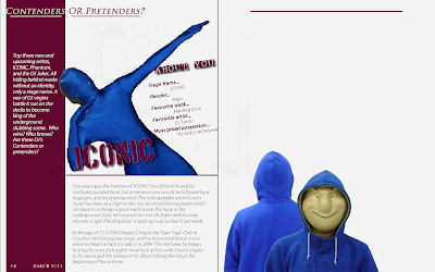
 The next step and it was time to introduce my next artist. In my short little introduction I wrote about there being 3 artists. However I am going to have two on the double page spread and a third on the next page. so for the first bit of my second artist I added an image. Keeping within the same idea as the front cover and the first artist I decided to keep my artist hidden behind a mask. This will make the audience really engaged, and make then want to read and find out who the man behind the mask really is.
DPS Step 3
Subscribe to:
Posts (Atom)


