
Tuesday, 29 March 2011

DPS Step 6
 This is the final step for my DPS, I decided to change the positioning of both artist names and I also added a little about me file like I did for the previous artist ICONIC.
DPS Step 5
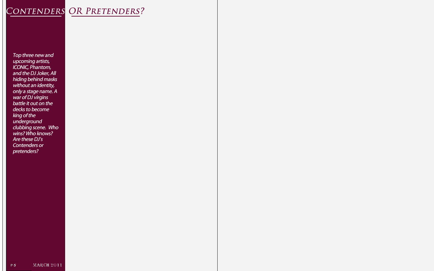
 Next i basically added the information about DJ Joker, I also added a line at the top of the page to give it a more professional look. Keeping within the theme on the following page I kept the same font for the artists name.
DPS Step 4
 The next step and it was time to introduce my next artist. In my short little introduction I wrote about there being 3 artists. However I am going to have two on the double page spread and a third on the next page. so for the first bit of my second artist I added an image. Keeping within the same idea as the front cover and the first artist I decided to keep my artist hidden behind a mask. This will make the audience really engaged, and make then want to read and find out who the man behind the mask really is.
DPS Step 3
 For the next step firstly i changed the font of the artists name, as the original font i though looked to unprofessional. i then added the infgormation about ICONIC, and by doing this finished my first artist.
DPS Step 2
 This is the second step, and as my double page spread is about artists i thought i would introduce my first artist and also my first story. Firstly i added an image of my artist, ICONIC, then i added his name in a bold impact font to give it a powerful effect.
DPS Step 1
 This is the first step for my DPS. firstly i set out the size of the page to A3 this is so i could fit to A4 pages on one page. As you can see from above the line down the middle indicates where the pages split. so for the first step i added the basics, which are the page number the date and the title. I also kept to my colour scheme going with the purple and white. i used a purple strip down the side to give it a good effect.
Wednesday, 16 March 2011
Talk with miss about my Front Cover,
Surprisingly I got a lot of positive feedback back about my music magazine front cover. I really didn't expect it to turn out as well as it did. However the only problem which I lacked which is the same with me in every subject is my spelling. So all I got to do is go through the spelling mistakes and correct them. Overall I am very pleased with the feedback miss gave me, and it really motivated me and I hope to continue my good work throughout my coursework. We also spoke about my double page spread and I am looking forward to creating this, I would like to include my main character 'Ironic' who is on the front cover in my DPS. But also add some more artists I would also like to include the 'hidden behind a mask scene' in my double page spread, as this would really engage the audience as they would want to find out who is hiding behind the mask.
Monday, 14 March 2011


Contents page step 4
 the final step i added my images to the magazine front cover, bare it in mind i wanted my images to reflect one of the stories inside my magazine. When i first took this images i new they didn't look that effective but after a short bit of editing and enhancing the colours and lighting on the images i thought the images looked good.
 Contents page step 3


Contents page step 2

The next step i added the stories down the write hand side. I made these colour of the font the same purple colour of what was used on the front cover of my magazine, to keep within the same colour scheme. I also made the titles to each heading a more larger and different font, with a brief quote or description below each title.
Contents page step 1

for my contents page i started completely different to my front cover. for my contents page i decided to start off with the writing and finish off with the images. so firstly in step one i set the layout of the contents page and added to the date, web address and titles.
Sunday, 6 March 2011

Front Cover step 6 without new label

After a lot of thought i thought the front cover of my music magazine looked better without the new label so therefore i got rid of it. The next post is a large image of the finished magazine front cover.
Front Cover step 5

This is the final step and my finished magazine Front cover. To finish it off i did two things i added a bar at the top which said three words, 'Listening, Dancing, Preforming,' these three words basically reflect the whole magazine in words. i thought that this would be a good thing to have on the front cover. Also as this is a new magazine i thought on the to corner i would add a new sign. this tells the audience that it is a new magazine.
Front Cover step 4

The forth step and it time to add in the content of my magazine on the cover. I took a lot of time into thinking of quick, short and effective heading for the content of my magazine, and thought the end headlines were right. Also i added a short coloured line in between each headline this made sure that it was clear and easy to read. As the centre dominant image arm and body are in an arch shape I thought maybe I could put the text from the headline to fit this shape.
Front Cover step 3

Front Cover step 2

For the next step to creating my music magazine front cover I thought I would add in a white background so that the blue man would appear to be jumping off the page. This made the centre dominant image really bold and effective. For this next step I also thought I would add in the basics of what every magazine needs like; barcode, price, date, etc so I would not forget them later on in the creating process.
Front Cover step 1

Subscribe to:
Comments (Atom)