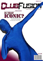
Step 3, for the third step I added my main headline to the front cover. I new that this headline would have to somehow reflect the centre dominant image so I based the headline around it. For the headline I made it a large army type font, this is to give the effect that it means business, the font is also in the same colour scheme as the masthead. I also made my main headline into a rhetorical question this would really engage the audience and make them want to find the answer by reading the magazine. Also I added in small font what the article is about, a quick short explanation.


No comments:
Post a Comment