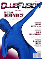
The forth step and it time to add in the content of my magazine on the cover. I took a lot of time into thinking of quick, short and effective heading for the content of my magazine, and thought the end headlines were right. Also i added a short coloured line in between each headline this made sure that it was clear and easy to read. As the centre dominant image arm and body are in an arch shape I thought maybe I could put the text from the headline to fit this shape.
No comments:
Post a Comment