Evaluation
Wednesday, 4 May 2011
Tuesday, 29 March 2011


DPS Step 6
 This is the final step for my DPS, I decided to change the positioning of both artist names and I also added a little about me file like I did for the previous artist ICONIC.
DPS Step 5
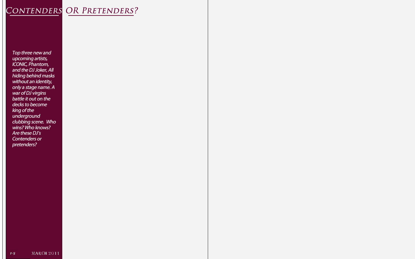
 Next i basically added the information about DJ Joker, I also added a line at the top of the page to give it a more professional look. Keeping within the theme on the following page I kept the same font for the artists name.
DPS Step 4
 The next step and it was time to introduce my next artist. In my short little introduction I wrote about there being 3 artists. However I am going to have two on the double page spread and a third on the next page. so for the first bit of my second artist I added an image. Keeping within the same idea as the front cover and the first artist I decided to keep my artist hidden behind a mask. This will make the audience really engaged, and make then want to read and find out who the man behind the mask really is.
DPS Step 3
 For the next step firstly i changed the font of the artists name, as the original font i though looked to unprofessional. i then added the infgormation about ICONIC, and by doing this finished my first artist.
DPS Step 2
 This is the second step, and as my double page spread is about artists i thought i would introduce my first artist and also my first story. Firstly i added an image of my artist, ICONIC, then i added his name in a bold impact font to give it a powerful effect.
DPS Step 1
 This is the first step for my DPS. firstly i set out the size of the page to A3 this is so i could fit to A4 pages on one page. As you can see from above the line down the middle indicates where the pages split. so for the first step i added the basics, which are the page number the date and the title. I also kept to my colour scheme going with the purple and white. i used a purple strip down the side to give it a good effect.
Wednesday, 16 March 2011
Talk with miss about my Front Cover,
Surprisingly I got a lot of positive feedback back about my music magazine front cover. I really didn't expect it to turn out as well as it did. However the only problem which I lacked which is the same with me in every subject is my spelling. So all I got to do is go through the spelling mistakes and correct them. Overall I am very pleased with the feedback miss gave me, and it really motivated me and I hope to continue my good work throughout my coursework. We also spoke about my double page spread and I am looking forward to creating this, I would like to include my main character 'Ironic' who is on the front cover in my DPS. But also add some more artists I would also like to include the 'hidden behind a mask scene' in my double page spread, as this would really engage the audience as they would want to find out who is hiding behind the mask.
Monday, 14 March 2011


Contents page step 4
 the final step i added my images to the magazine front cover, bare it in mind i wanted my images to reflect one of the stories inside my magazine. When i first took this images i new they didn't look that effective but after a short bit of editing and enhancing the colours and lighting on the images i thought the images looked good.
 Contents page step 3


Contents page step 2

The next step i added the stories down the write hand side. I made these colour of the font the same purple colour of what was used on the front cover of my magazine, to keep within the same colour scheme. I also made the titles to each heading a more larger and different font, with a brief quote or description below each title.
Contents page step 1

for my contents page i started completely different to my front cover. for my contents page i decided to start off with the writing and finish off with the images. so firstly in step one i set the layout of the contents page and added to the date, web address and titles.
Sunday, 6 March 2011

Front Cover step 6 without new label

After a lot of thought i thought the front cover of my music magazine looked better without the new label so therefore i got rid of it. The next post is a large image of the finished magazine front cover.
Front Cover step 5

This is the final step and my finished magazine Front cover. To finish it off i did two things i added a bar at the top which said three words, 'Listening, Dancing, Preforming,' these three words basically reflect the whole magazine in words. i thought that this would be a good thing to have on the front cover. Also as this is a new magazine i thought on the to corner i would add a new sign. this tells the audience that it is a new magazine.
Front Cover step 4

The forth step and it time to add in the content of my magazine on the cover. I took a lot of time into thinking of quick, short and effective heading for the content of my magazine, and thought the end headlines were right. Also i added a short coloured line in between each headline this made sure that it was clear and easy to read. As the centre dominant image arm and body are in an arch shape I thought maybe I could put the text from the headline to fit this shape.
Front Cover step 3

Front Cover step 2

For the next step to creating my music magazine front cover I thought I would add in a white background so that the blue man would appear to be jumping off the page. This made the centre dominant image really bold and effective. For this next step I also thought I would add in the basics of what every magazine needs like; barcode, price, date, etc so I would not forget them later on in the creating process.
Front Cover step 1

Monday, 28 February 2011


Final Mast Head Design
 This is my final Mast Head design i think it looks really good and looks a lot better than i intended. I used a purple, mauve colour which really fits in with the black fusion colour. I also added my strap line in underneath the word fusion. 'fueling London's underground clubbing scene' this is my strap line and it fits in with the masthead. I also decided to put a white line through the font which gave an even better effect.
Final Masthead Design
 This is my original mast head design in a nice bold font with no extras added to it the only thing i have done is change the colour of the word club to a purple, maroon colour.
Ideas for front cover - mast head NO2

These are three different font I really liked. I did like the title M&R but when I thought club fusion I thought this is what my magazine shall be called. in all three fonts but the two words together but still used capitals so that each word is still different. I really like this type of font as it is a very strict, bold font.
 This is the second font I chose this font is a more smaller width than the one above. It is more squashed up rather than stretched.
 This is another font I did like this font yet I thought it was far to simple. I didn't like as in my magazine I want to go for to extraordinary look.
 This is the second font I chose this font is a more smaller width than the one above. It is more squashed up rather than stretched.
 This is another font I did like this font yet I thought it was far to simple. I didn't like as in my magazine I want to go for to extraordinary look.
Ideas for front cover - mast head NO1
 after looking at many magazines and doing a lot of research i thought i would keep the title of my magazine to initials. i got this idea from the magazine FHM as they use initials. the font i used was a black and white cracked font with paint splash marks. this gave it a very effective look.
 i used the initials effect to come up with this final example i was to call the magazine 'Music Revolution' so the initials MR are short i wrote music revolution underneath and stated that the magazine will be about dubstep by having a strap line on the right hand side which fits with the title.
Thursday, 3 February 2011
Pre-Lim Task (Contents Page)
 This is the Contents page for my Pre-lim task. This is a contents page for the magazine 'His & Hers' a magazine about the life of a sixth former. From my research i have put this contents page layout together. i especially liked the Kerrang style contents page and based my contents page around that. As my contents page is about sixth formers, I thought for my headlines i should ask sixth formers what they would like to know. Then base my headlines round my research. By doing this task has really improved my Photoshop skills, and i hope to improve my skills even more and make a fantastic final product for my music magazine.
Wednesday, 2 February 2011
Men's Lifestyle Magazine (Contents page)

This an analysis of the most basic contents page i've come across through all my research. This is a contents page for FHM a men's life style magazine. i can immediately tell this magazine is aimed at a male audience from the image of a women in her under-where, this would attract a male audience.
The mast head FHM is in a red/orange colour with the word 'Contents' below it. the word contents is laid out so that it almost hides behind the head of the model.
this Contents page almost looks like a front cover of a magazine. This is because of the centre dominate image it has of the model.
The font used for this contents page is simple and is in a small proportion to the image. the headings are in a bolder font with a very brief summery of each page in a normal font. The use of the speech box to title the features of the magazine, i thought was very effective. it is almost as if the magazine is talking to the audience.
Women's Lifestyle Magazine (Contents page)
 This is an analysis for a women's lifestyle magazine. the layout for this 'marie claire' is very simple, buy being simple it makes the contents page very clear to the reader. This contents page doesn't use a lot of colour. However the colours it does use are used very effectively. The colour red is used a lot, this is an ideal colour for a women's lifestyle magazine as the colour red reflects love.
The Heading for this contents page such as 'ON THE COVER' and 'FASHION FEATURES' are in a larger red font and are all in capitals. this stands out to audience/viewer of the magazine and will draw them to the subject.
There is a large image of a women leaning against a wooden post, which feels over 1/2 of the page. From looking at the contents page i was drawn towards this image straight away. as you can see she is wearing very fashionable clothing and this is linked with the women's magazine.
The masthead of the magazine 'marie claire,' is on the contents page as well as on the front cover. i like how the word CONTENTS' is directly below the 'marie claire,' i also like how the word 'marie clare' is indented.
Thursday, 6 January 2011
MixMag, double page spread

Colour Scheme:
- The editors on this double page spread have used the colour scheme of pink, yellow, black, and a white background. They have used these colours to convey a party atmosphere as they are vibrant and, they have used the black so they stand out even more. This will encourage the readers to read this article as MixMag is a dance magazine.
layout:
The layout for this Mixmag double page spread has been you very effectively. This double page spread has been set out professional, all the images are in line with the text and are in boxes, unlike the kerrang double page spread where it is more wild and all over the place. However my magazine is set at a clubbing audience and therefor more wild so I would not use this plain layout.
Text:
Like the kerrang double page spread there is a lot my writing than there is images. However this is expected with double page spreads. As long as there is a balance between images and text then it will work and I think the Mixmag producers have designed this so there is a balance.
Kerrang! double page spread
 Colour scheme:
the colour scheme used on this double page spread coincides with the colours of which the group are wearing especially the lead singing with the red. This allows the text to stand out, which makes it easy to read. Also the colours used don't contrast each other
Layout:
The layout of this double page spread for Kerrang! Magazine, I think works extremely well. This lay out is basic and very simply yet very effective. With a main centre dominant image in the centre of both pages, and littler pictures in boxes with red borders all centered around the main image. The text is also alined like a newspaper which gives it a professional effected.
Text:
There is a lot more text than there is images, however at first glance it looks equal so the reader isn't overwhelmed by text. This is also why the text is in a smaller size font. All of the headings on this DPS are all done in capitals. This gives off the effect that this point is important, which will draw the reader in to read it.
Size:
The size is very varied on this double page spread. the images are all large whereas the text is very small, I think this is so that they can fit more information onto the page. Also the images are larger as every image tells its own story.
Contents page (MixMag)
 Layout
this is the contents page for Kerrang! this contents page has one main centre dominant image. which is a man drinking a can of beer, in a night club. this gives off the clubbing scenes which reflects the genre for this magazine. i like the way the designed had layed out this page. With all the content of the magazine down the left hand side, with a short powerful headings. the main thing i like about this magazine contents page is the way it has been layed out. its simply yet very effective at the same time,
Masthead:
the mast head on the contents page is relevant to the font cover. in the way that the font used is the same font used for the strap line.
Colour scheme:
like the Kerrang! contents page colour is its downfall. the colours used are dull, the back ground is white and the font colour is black which is plain and simply yet effective. when i make my contents page i want to add more colours into it.
Font:
the font used on this contents page is like the font used on the Kerrang! contents page its a very simply font which you find everywhere. the headings for each page however are done in a bold font which gives the important effect.
size:
The size of everything on this page is a key factor. The images and font. The images are large and fill up most of the page. this shows that these images are important.
Subscribe to:
Comments (Atom)